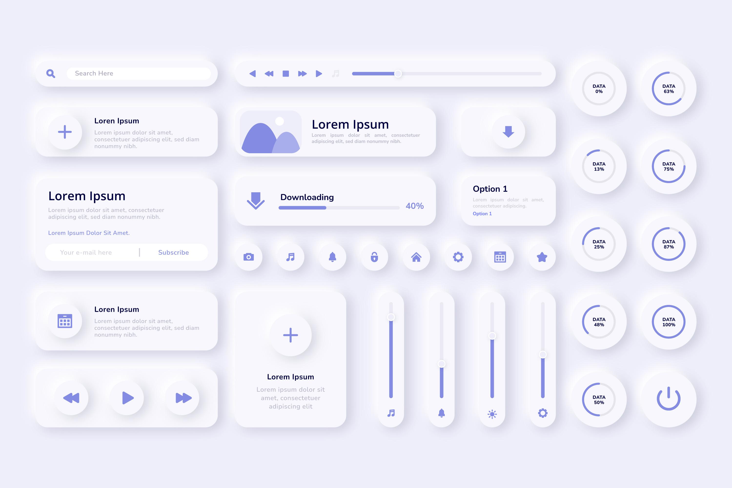
Neumorphism is a portmanteau of “new” and “skeuomorphism,” which is a design style that imitates real-world objects in digital interfaces. Neumorphism has recently emerged in the UX and UI design community, and blends flat design elements with skeuomorphic characteristics, creating a soft, realistic look that gives digital interfaces a pseudo-3D effect. Neumorphic design uses a combination of shadows, highlights, and gradients to create depth and a tactile feel, making elements appear as if they are extruding from or embedded into the background. This effect often results in a minimalist aesthetic with a modern, polished finish.
To effectively use neumorphism in UX design, balance visual appeal with usability. Here are some key considerations:
- Subtle Shadows and Highlights: Use soft shadows and highlights to create the characteristic “pushed-in” or “popped-out” effect. This should be subtle to avoid making the design feel heavy or cluttered.
- Monochromatic Color Schemes: Neumorphism works best with a limited color palette, often sticking to various shades of gray or pastels. This helps maintain the minimalist feel and ensures the focus remains on the tactile elements.
- Contrast and Accessibility: While neumorphism can be visually striking, it may pose challenges for accessibility, especially for users with visual impairments. It’s crucial to ensure enough contrast between elements and background to maintain readability and usability.
- Selective Application: Apply neumorphic elements selectively. Overusing them can make the design appear monotonous or reduce the overall usability. Neumorphism is best suited for specific interface elements like buttons, cards, and switches, where its effects can shine without overwhelming the user.
Visual Characteristics to Look For:
- Soft Shadows and Highlights: Look for elements that have both dark and light shadows, giving them a soft, embossed, or debossed look.
- Muted Color Palette: Neumorphic designs often use light, desaturated colors or monochromatic shades to avoid overpowering the subtle 3D effect.
- Minimalist Aesthetic: The overall design tends to be clean and simple, with few distractions, allowing the depth and shadows to take center stage.
- Smooth, Rounded Corners: Elements often have smooth, rounded edges to create a soft, approachable look.
How to Create Neumorphic Visuals:
- Button Design: Create a button that looks like it’s either raised above the surface or embedded into it. This can be achieved by using two shadows: a dark shadow at the bottom right to simulate depth and a lighter shadow at the top left to simulate light hitting the surface. The button should have rounded corners and use soft, pastel colors to enhance the 3D effect.
- Card Design: Design a card component with similar shading techniques. The card should have a soft, beveled edge that gives the illusion of it being lifted slightly from the background. Use a gradient background that subtly shifts from lighter to darker shades to emphasize the depth.
- Switch Toggle: A neumorphic switch toggle can have an “on” and “off” state, each with a different depth effect. The “on” state could look like a raised circle with a shadow, while the “off” state could appear as a recessed circle with an inner shadow. This creates a realistic, tactile feel.
Incorporating neumorphism into your UX design can bring a fresh and modern aesthetic that enhances the user experience by creating a sense of depth and tactility. However, it’s important to use this style thoughtfully, balancing its visual appeal with functionality and accessibility. By understanding the principles of neumorphism and applying them selectively, you can create engaging, visually striking interfaces that delight users without compromising usability. As with any design trend, the key is to experiment and adapt, finding the right balance that aligns with your brand’s identity and meets the needs of your audience. Neumorphism is just one of many tools in a designer’s toolkit, and when used effectively, it can add a unique, contemporary touch to your digital projects.
Image by Freepik


