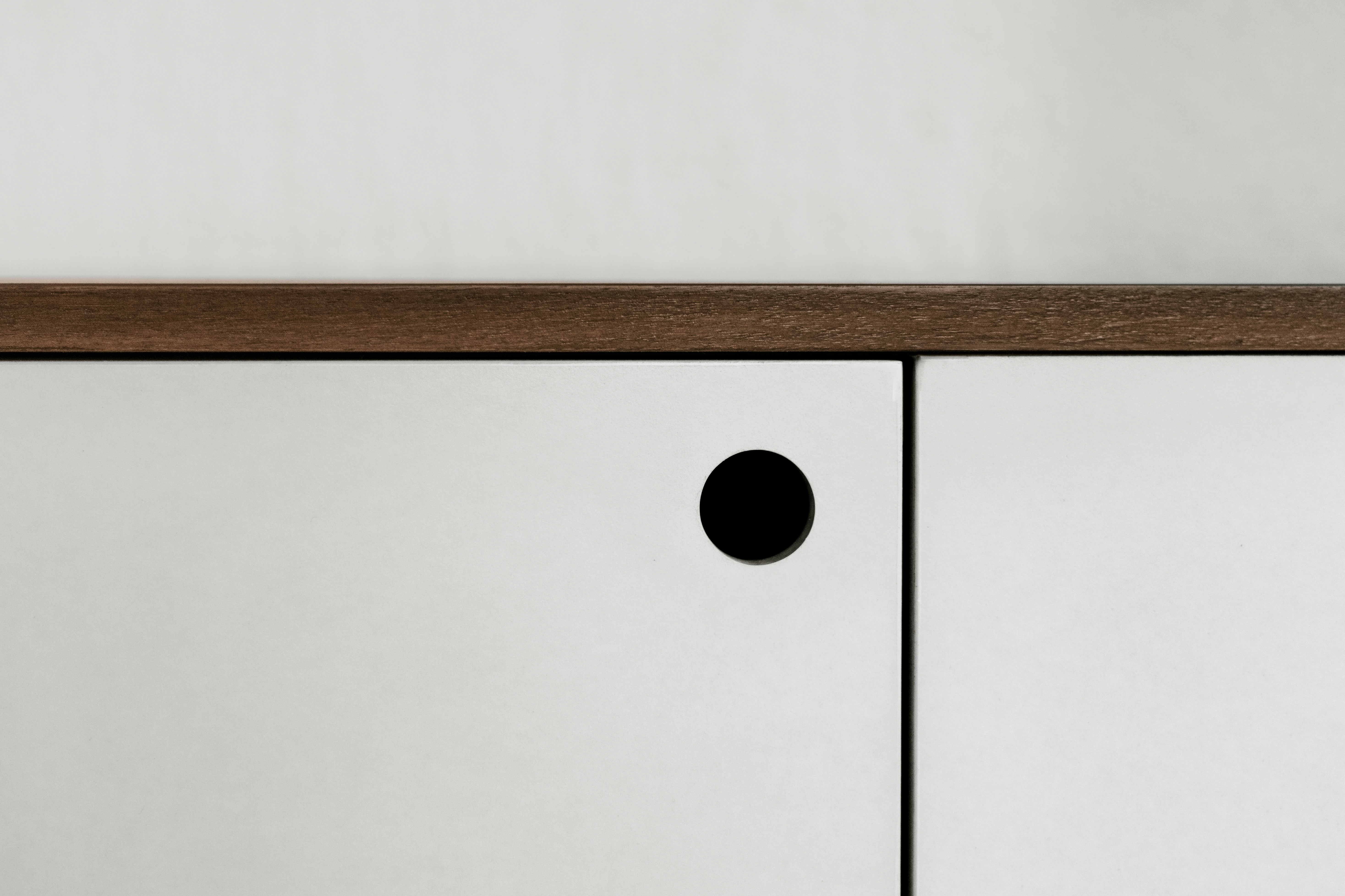
Minimalist design has been a go-to style in the world of modern aesthetics for a while now—think clean lines, simple layouts, and only the essentials. Inspired by movements like Bauhaus and Scandinavian design, minimalism has moved beyond architecture and home decor into digital spaces like websites, apps, and branding. But here’s the tricky part: how do you keep things looking sleek and simple without making them harder to use? Finding that sweet spot between beauty and usability is key to making sure your design not only looks good but also works well for real people.
The Appeal of Minimalism
Minimalist design’s primary strength lies in its ability to reduce clutter and focus attention. By eliminating unnecessary elements, it creates a visually appealing and distraction-free environment, whether it’s a physical space or a digital product. In web and app design, minimalist interfaces emphasize clarity and improve the overall user experience by guiding users toward key actions and content.
Minimalist designs tend to load faster, perform better, and feel timeless. By prioritizing only essential elements, designers reduce the cognitive load on users, making navigation intuitive and straightforward. From Apple’s sleek product designs to Google’s search homepage, minimalism has proven its effectiveness in creating engaging and accessible experiences.
Functionality: The Core of User Experience
Functionality, however, is the heart of any product or design. A beautifully minimalist interface is meaningless if users can’t easily accomplish their goals. Functionality encompasses more than just the technical ability of a product to perform tasks—it includes how well those tasks are integrated into the design and how accessible they are to diverse users.
When functionality is overlooked in the pursuit of minimalism, the result can be frustrating for users. For example, overly simplified navigation menus or hidden features can leave users confused or unable to find the tools they need. This is often referred to as “dark minimalism,” where the absence of visible options sacrifices utility for the sake of aesthetics.
Finding the Balance
The ideal design balances minimalism and functionality. This involves understanding user needs, iterating on designs, and being willing to compromise. Here are some strategies to achieve that balance:
- User-Centered Design: Prioritize the needs of your audience. Conduct user research to understand which features are essential and design around those requirements. Minimalism should never come at the cost of excluding key functionalities.
- Progressive Disclosure: Instead of overwhelming users with options, hide secondary or advanced features behind intuitive pathways. This ensures that the primary interface remains clean while retaining functionality for power users.
- Accessible Minimalism: Make sure minimalist designs are inclusive. For instance, ensure sufficient contrast for readability, provide clear visual cues, and avoid relying solely on icons without labels, which can confuse users unfamiliar with their meanings.
- Test and Iterate: Regular usability testing can reveal whether a design is too minimal. Real user feedback will highlight what works and what doesn’t, enabling designers to fine-tune the balance.
The Case for Thoughtful Design
Ultimately, the goal is not to choose between minimalism and functionality but to integrate the two seamlessly. A thoughtfully designed product achieves simplicity without sacrificing the user’s ability to interact effectively. This balance not only enhances usability but also fosters trust and satisfaction, ensuring that the design serves its ultimate purpose: solving problems and improving lives.

