If you’ve been following our Ideas here at Flower Press, you might have read a few recent posts illustrating the challenges we face as creatives when working to transition from innovative design to development, all while working within the reality of client budget constraints. Figma has been a valuable tool that helps us bridge the gap between designers and engineers. My job at Flower Press (one of my jobs, at least) has been to build our front-end UI interfaces created by our talented design team. With that in mind let’s talk a bit about Components and Variables, how they relate to development, and the tools Figma brings to the table.
Crafting Harmony: Components are essential workers
Components are the building blocks that create all the pieces we need to build screens in our custom apps. Components can be as simple as a text or button component with different properties for weight and size or as complex as a whole navigation bar. The general rule is if it is going to be used more than once in your app make it a component! Once you have created a component it can be reused, duplicated and modified across many projects.
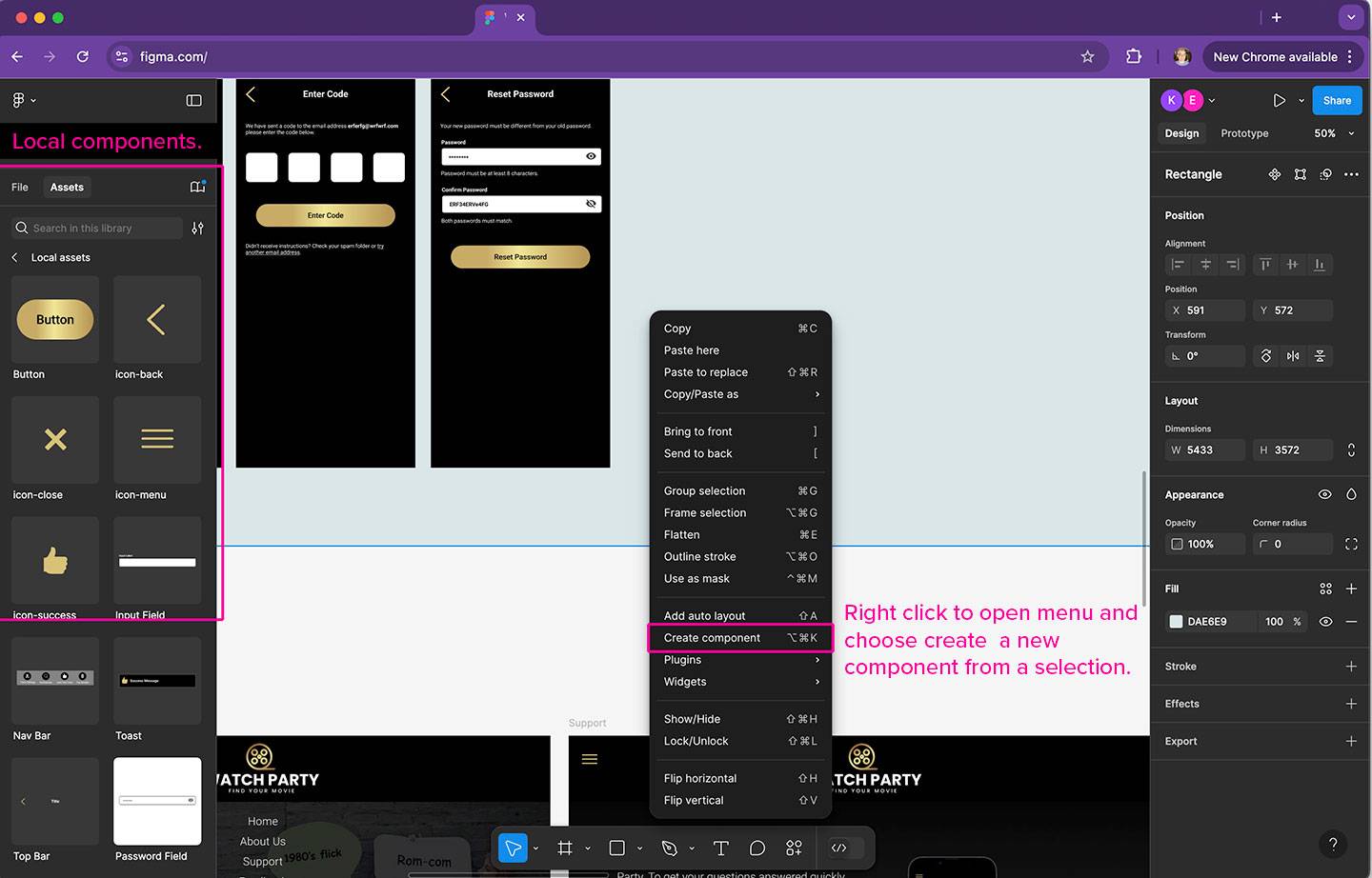
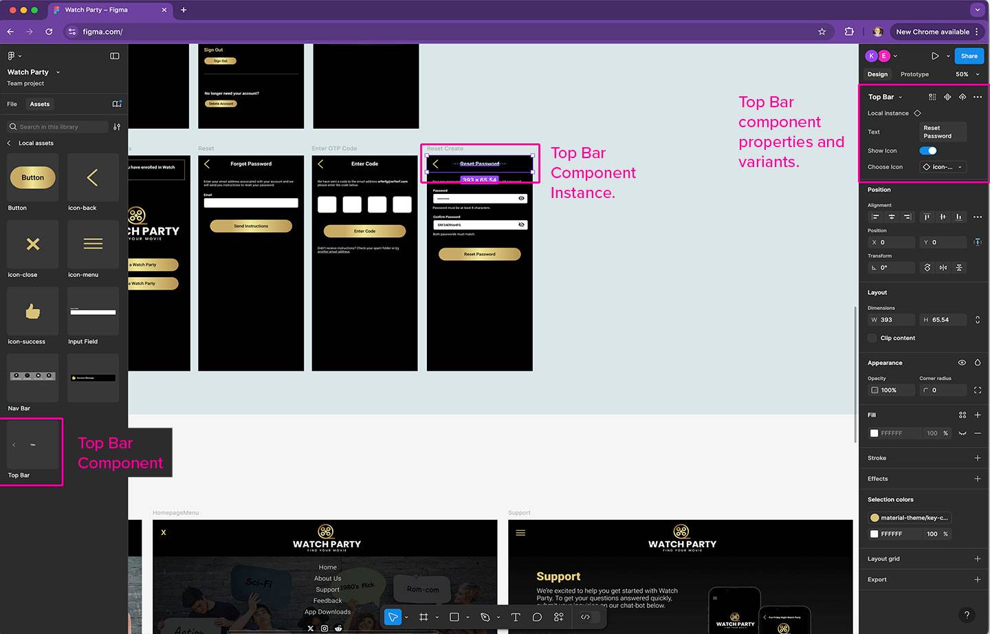
Creating components in Figma is as easy as selecting the elements you want and clicking the create component button. After an element or group has been converted to a component you will notice new options in your right panel, for things like renaming and various properties. When you are happy with your component you might need to publish it and then your component can be viewed in the Assets panel (left toolbar “Local assets”).

From the Assets panel you can drag instances of components into your designs. If you later decide to change the original component, all instances of it will also be updated. It quickly becomes evident how this can be a powerful tool to speed up your design process. In addition you can create ‘Variations’ of your components with multiple properties for changes like background color, or to hide and show icons. All of this helps the developers visualize how they need to build the components when in the conversion phase, as well as keeping your designs nice and tidy.

Maintaining Sanity: Variables to the Rescue
Designers who have worked with SASS to create CSS might already be familiar with variables. By defining variables such as colors, fonts, and spacing, designers can quickly tweak design attributes across the project without the need to manually adjust each element. Figma allows designers to create robust design systems that developers can understand and reference and even turn into themes. This works to reduce design mismatches and discrepancies and helps to lower the stress levels of our designers as they view the results of their vision. Developers can also find cause to rejoice as they receive a well-organized design system that translates seamlessly into code, reducing the back-and-forth that often accompanies design tweaks.
The combination of components and variables in Figma really helps bring designers and developers closer together. Designers can focus on crafting beautiful user experiences without getting bogged down by repetitive tasks, while developers can find a design system that they can quickly understand and reference to bring the app to file. This leads to more efficient development cycles, fewer errors, and a finished product that reflects the vision of the creatives.

